Web Analytics Made Easy - Statcounter

Tema düzenleyici

XenForo Hareketli Bildirimler

  • Konuyu Başlatan Konuyu Başlatan HAN
  • Başlangıç tarihi Başlangıç tarihi
  • Cevaplar Cevaplar 0
  • Görüntüleme Görüntüleme 102
Yönetici
HAN

HAN

WFN Moderatör
Katılım
9 Nis 2024
Mesajlar
672
Çözüm
2
Tepki Skoru
388
Ticaret Puanı
0
Üyelik
2 Yıl 27 Gün
Konum
YurtDışı
Web Sitesi
Var
Alanı
SEO Uzmanı
1/3
Konu sahibi
Bu eklenti, add-ons XenForo 2.2.X ile uyumlu ve stabil olarak çalışmaktadır.

Uyumlu XF 2 Sürümleri
  1. 2.2.X
  2. 2.0.X
  3. 2.1.X
Merhabalar, forumunuza hareketli bildirim ve hareketli özel mesaj bildirimi ekleyebilirsiniz. Bildirim geldiğinde hareket eden bir zil ve hareket eden bir shadow ekliyoruz.

Bildirimler alanına animasyon eklemek için kullandığınız temanın extra.less şablonunu açın ve aşağıdaki kodları ekleyip kayıt edin..
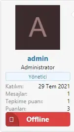
Less:
@keyframes xgtbell {
    0% {
        transform: rotate(0);
    }
    10% {
        transform: rotate(30deg);
    }
    20% {
        transform: rotate(0);
    }
    80% {
        transform: rotate(0);
    }
    90% {
        transform: rotate(-30deg);
    }
    100% {
        transform: rotate(0);
    }
}
@-webkit-keyframes xgtNotificationAnim {
    to {
        box-shadow: 0 0 0 12px rgba(232, 76, 61, 0);
    }
}
@-moz-keyframes xgtNotificationAnim {
    to {
        box-shadow: 0 0 0 12px rgba(232, 76, 61, 0);
    }
}
@-ms-keyframes xgtNotificationAnim {
    to {
        box-shadow: 0 0 0 12px rgba(232, 76, 61, 0);
    }
}
@keyframes xgtNotificationAnim {
    to {
        box-shadow: 0 0 0 12px rgba(232, 76, 61, 0);
    }
}
.js-badge--alerts.badgeContainer--highlighted {
    i {
        &:after {
            animation: xgtbell 1s 1s both infinite;
        }
    }
    border: none;
    box-shadow: 0 0 0 0 rgba(225, 228, 227, 0.7);
    border-radius: 10%;
    background-size: cover;
    background-repeat: no-repeat;
    cursor: pointer;
    -webkit-animation: xgtNotificationAnim 1.25s infinite cubic-bezier(0.66, 0, 0, 1);
    -moz-animation: xgtNotificationAnim 1.25s infinite cubic-bezier(0.66, 0, 0, 1);
    -ms-animation: xgtNotificationAnim 1.25s infinite cubic-bezier(0.66, 0, 0, 1);
    animation: xgtNotificationAnim 1.25s infinite cubic-bezier(0.66, 0, 0, 1);
}

Ekran görüntüsü:

bildirimanim.gif


Hem özel mesaj alanına hem de bildirim alanına uygulamak istiyorsanız aşağıdaki kodları ekleyiniz.

Less:
[CODE=less]@keyframes xgtbell {

    0% {
        transform: rotate(0);
    }

    10% {
        transform: rotate(30deg);
    }

    20% {
        transform: rotate(0);
    }

    80% {
        transform: rotate(0);
    }

    90% {
        transform: rotate(-30deg);
    }

    100% {
        transform: rotate(0);
    }

}

@-webkit-keyframes xgtNotificationAnim {
    to {
        box-shadow: 0 0 0 12px rgba(232, 76, 61, 0);
    }
}

@-moz-keyframes xgtNotificationAnim {
    to {
        box-shadow: 0 0 0 12px rgba(232, 76, 61, 0);
    }
}

@-ms-keyframes xgtNotificationAnim {
    to {
        box-shadow: 0 0 0 12px rgba(232, 76, 61, 0);
    }
}

@keyframes xgtNotificationAnim {
    to {
        box-shadow: 0 0 0 12px rgba(232, 76, 61, 0);
    }
}

.badgeContainer--highlighted {
    i {
        &:after {
            animation: xgtbell 1s 1s both infinite;
        }

    }

    border: none;
    box-shadow: 0 0 0 0 rgba(225, 228, 227, 0.7);
    border-radius: 10%;
    background-size: cover;
    background-repeat: no-repeat;
    cursor: pointer;
    -webkit-animation: xgtNotificationAnim 1.25s infinite cubic-bezier(0.66, 0, 0, 1);
    -moz-animation: xgtNotificationAnim 1.25s infinite cubic-bezier(0.66, 0, 0, 1);
    -ms-animation: xgtNotificationAnim 1.25s infinite cubic-bezier(0.66, 0, 0, 1);
    animation: xgtNotificationAnim 1.25s infinite cubic-bezier(0.66, 0, 0, 1);
}

Ekran görüntüsü:

dildirimDmAnim.gif


Eğer shadow hareketinin ayrı ayrı hareket etmesini istiyorsanız özel mesaj (DM) animasyonu için aşağıdaki kodları yukarıdaki özel mesaj less kodları yerine kullanabilirsiniz.

Less:
@keyframes xgtDM {
    0% {
        transform: rotate(0);
    }
    10% {
        transform: rotate(30deg);
    }
    20% {
        transform: rotate(0);
    }
    80% {
        transform: rotate(0);
    }
    90% {
        transform: rotate(-30deg);
    }
    100% {
        transform: rotate(0);
    }
}
@-webkit-keyframes xgtConversationsAnim {
    to {
        box-shadow: 0 0 0 12px rgba(232, 76, 61, 0);
    }
}
@-moz-keyframes xgtConversationsAnim {
    to {
        box-shadow: 0 0 0 12px rgba(232, 76, 61, 0);
    }
}
@-ms-keyframes xgtConversationsAnim {
    to {
        box-shadow: 0 0 0 12px rgba(232, 76, 61, 0);
    }
}
@keyframes xgtConversationsAnim {
    to {
        box-shadow: 0 0 0 12px rgba(232, 76, 61, 0);
    }
}
.js-badge--conversations.badgeContainer--highlighted {
    i {
        &:after {
            animation: xgtDM 1s 1s both infinite;
        }
    }
    border: none;
    box-shadow: 0 0 0 0 rgba(225, 228, 227, 0.7);
    border-radius: 10%;
    background-size: cover;
    background-repeat: no-repeat;
    cursor: pointer;
    -webkit-animation: xgtConversationsAnim 1.5s infinite cubic-bezier(0.66, 0, 0, 1);
    -moz-animation: xgtConversationsAnim 1.5s infinite cubic-bezier(0.66, 0, 0, 1);
    -ms-animation: xgtConversationsAnim 1.5s infinite cubic-bezier(0.66, 0, 0, 1);
    animation: xgtConversationsAnim 1.5s infinite cubic-bezier(0.66, 0, 0, 1);
}

Ekran görüntüsü:

dildirimDmAnim2.gif


Sende şimdi bize katılmak ister misin?

Kayıt ol

Bize katılım kolay ve ücretsizdir!

Giriş Yap

Zaten bir hesabınız var mı? Buradan giriş yapın.

← Önceki Konu

XenForo Online Offline Durum Yapılandırma

  • HAN
  • Cevaplar: 0
Foruma git ?

Bu konuyu görüntüleyen kullanıcılar

Haftanın Trendleri

Ayın Trendleri

İpuçları
Geri
Üst